Saturday 17 December 2011
Ancillary: Billboard poster
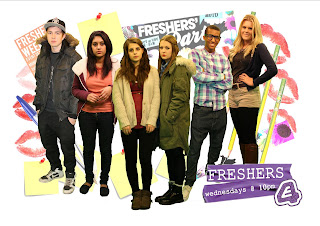
Here is my final billboard poster after the audience feedback:
I think this version of the billboard poster did look better because the characters stand out more and the attention is drawn fully to them. It also makes the audience aware that they are still in an educational and young environment because of the back ground pictures which represent our target audience:
- The 'FRESHERS WEEK' poster represents that they are first year students at university and adds meaning to the name of the soap which is called 'FRESHERS'. It also shows they like going out, drinking and having fun.
- The post it notes are what students may possibly use for last minute revision as well as to reference revision too or make notes on and are a well known stationary product used by students
- The kiss marks connote the love dramas in the soap which could reference to cheating, girls flirting, nights out - one night stands and teenage love is what all our target audience could relate to.
- The pens and pencils are what all students use no matter what age they are.
ANCILLARY: Magazine front cover
Here is my final magazine front cover ancillary.
- It is a newspaper supplementary product which is why it says "News of The World". We felt this would have been a good newspaper to use as it always had top scandals and news teenagers would be interested in when it existed.
- It is a special therefore features about other television soaps or series didn't need to be included on this.
- Use of different fonts makes the front cover look less 'trashy' and more 'classy'.
- Gay stereotype used on JP - Chequered shirt in bright colours with all buttons done up and geeky glasses represent his character well.
Friday 16 December 2011
EVALUATION Q4
In this video I made on iMovie using Quicktime's screen recording, I showed how I imported videos, cropped into clips, added slow motion and added transitions. I found this was the easiest way to show how I did it.
Wednesday 14 December 2011
Ancillary: Billboard poster
- Freshers posters represent that these are first year uni students.
- The lipstick marks indicate there is romance and sexuality in the show.
- The emotions of each characters face are shown - shows there is a story behind each person.
- 'FRESHERS' and E4 logo are purple - the channel's brand identity.
- Day and time the soap is shown makes it clear to audience.
- Pens, pencils and post it notes show they're all in an educational environment.
Tuesday 13 December 2011
Audience mood board
RELATES TO EVALUATION QUESTION 1 - AUDIENCE RESEARCH

We did an audience mood board together to show what are target audience would be interested in:
- The 'Vans' trainers, baseball cap, glasses and clothes store names show that the generation we are targetting are interested in fashion which makes it clear for us to know our characters have to be dressed in modern, fashionable clothing.
- Twitter and Facebook - the social network sites are what our target audience use on a daily basis so we could add a "#freshers" trend to twitter or make a facebook page for our show.
- The make-up show that people are aware of their appearance and take pride in their appearance so even though our characters are going to be going through bad times, they still would wear make up when outside and be conscious about how they look.
- The phone shows that our target audience rely on their phones a lot. In our trailer, texting and ringing each other has a big play on storylines so the audience could relate to how people text each other their problems or simply putting the phone down on someone.
- The energy drink shows that our target audience do stay up and have a lot of late nights to be tired in the morning for college or university. Also our target audience go out a lot at night and would have an energy drink the next day to make them feel more awake. We didn't play on this in the trailer but we did use drugs which is something everybody knows about.
Wednesday 7 December 2011
Eastenders - Ancillary Practice
LINKED TO EVALUATION Q2
Here in my practice ancillary I watched a clip of EastEnders and used a screen grab of a suitable image I could use in a billboard. I then added a caption to help convey the story line as "When secrets are revealed..." It looks like the man has something to hide from the woman in this picture and the framing of the man between the door frame emphasises the fact that he's there though it seems like he shouldn't be as he's watching the woman reading opened letters. I also put the name of the show, the times it's shown and the channel as it is a form of advertisement and viewers would need to know this information.
PLANNING: Ancillaries
Before I made my ancillaries I had plans of how I wanted them to look at first. I did a basic sketch of each one to show the basic layout of what I wanted. Here are the images of my sketches.
BILLBOARD DESIGN
MAGAZINE DESIGN
Practice Ancillary
LINKED TO EVALUATION Q2
Here, I made a practice ancillary using an original and screen grabs from a soap to help me understand the conventions of a magazine. I tried to make my version like the classy version I mimicked but the genre I used didn't match so my version looks like a trashy magazine.
Subscribe to:
Posts (Atom)


